
EXTRAORDINARY EVERYDAY: THE ART & DESIGN OF ERIC RAVILIOUS

In November 1938, Country Life Books published High Street, a children’s book featuring colour lithographs by Eric Ravilious of twenty-four businesses (including two restaurants, a pub and an amusement arcade). Reviewing the book for The Architectural Review, Raymond Mortimer commented, ‘We are taught at school to solve equations, to bowl, to conceal our misdeeds, to suck up to the powerful, but few of us are taught to use our eyes.’ This might be a good thing, he suggested, given the architectural horrors on show across Britain, yet ‘even in modern cities, even in Oxford Street and Regent Street where every prospect displeases, the trained, hunting eye can mark down beauty. This gay enchanting book teaches us how to stalk.’
Not that Ravilious himself went ‘hunting’ for the shops he depicted. The process was more organic than that. It took time. Some shops he passed on the bus or walked past every day for years, their fronts becoming as familiar to him as the face of a favourite model to a portrait painter. Others he remembered from earlier periods of his life and revisited, or happened upon by chance on the way to see a friend. Most of the shops of High Street were not particularly special; they just happened to be part of Ravilious’ everyday life.
 |
| Pharmaceutical Chemist, lithograph, 1938 |
That these shops seem so extraordinary – jewel-like, magical – when we open the pages of the book is thanks to the artist’s vision, skill and knowledge. He chose to portray his Pharmaceutical Chemist at night, so that light from inside the shop shines through the bottles in the window display. This makes for a compelling image, but he may well have borrowed the idea from French illustrator Lucien Boucher, whose extraordinary book of Parisian shops was published in 1925. Boutiques was so well-known at the time that Ravilious must have seen it, and it is unlikely to be a coincidence that Boucher’s pharmacy features similarly illuminated green and red bottles in the window. In fact references and in-jokes are scattered throughout High Street, and why not? The places we know well are full of ghosts and associations.
We should be wary of assuming that the shops of High Street are all real places realistically described. Thanks to research by Tim Mainstone we know, for example, that the penny farthing bicycle adorning Hardware did not belong there. The shop front is a stylized version of a real shop in Castle Hedingham, Essex, where Ravilious lived with his wife Tirzah (née Garwood) and son John (b. 1935), but the bicycle stood over the door of a cycling shop in nearby Sudbury. It advertised the shop, of course, but it was also a bit of a joke, because the pub next door sported a splendid white horse above the entrance. Ravilious probably included the bicycle because the owner of the Hedingham hardware shop, Bennett Smith, was a keen cyclist, and he also brought the horse into the story, placing it above the door of his Saddler and Harness Maker.
 |
| Hardware, lithograph, 1938 |
So the rivalry is preserved forever. Shops came naturally as a subject to Ravilious, whose father Frank ran an antiques shop in Eastbourne when he was growing up. The family moved to the Sussex town from west London in 1908, when Eric was five, settling in the new suburb of Hampden Park. By some years the youngest of three children, Ravilious was remembered by schoolmates as cheerful and popular, inclined more to mischief than to hard work. Family life was in some respects quite ordinary, but although Frank was a good businessman he was prone to bouts of religious mania which eventually pushed him into bankruptcy when Eric was in his late teens. Meanwhile, years of childhood Chapel-going left Eric with a horror of boredom and a belief in tolerance, but did he inherit any of his father’s religious fervour? Did life as young Methodist influence his artistic development?
He certainly had an active imagination and a tendency to withdraw into his own thoughts when bored: traits that might have been developed during long services. And then there’s his fixation with light. Ravilious greatly admired Samuel Palmer, an artist of the previous century whose paintings shine the light of religious salvation over the English countryside. Although Ravilious was friendly with Guy Hepher, the vicar of St Nicholas, Castle Hedingham, and went along to the occasional Harvest Festival or Christmas service, there is no evidence that he held strong Christian convictions. His work nevertheless is filled with light, whether shining from the window of a pharmacy or gleaming on water; light that shimmers not so much across as within the surface of his wood engravings, lithographs and watercolours. Did this express some inner spiritual feeling or was it simply a matter of style? Whatever the answer, this inner gleam is one of the characteristics that makes the most everyday subject matter extraordinary in his hands.
Another characteristic is the quality of lightness he brought to his work. We see this in surviving drawings from his schooldays, in which the subject – a boot, perhaps, or a bar of soap balanced on a scrubbing brush – is drawn with such clarity that it seems to be actually standing before us. Ravilious dreamed vividly and as a young man sent his friends lengthy descriptions of his dreams. His youthful drawings seem to show us objects that belong in a dream, objects that are powerfully present yet weightless. Many years later he adopted a more sophisticated version of this youthful style in his design for a child’s handkerchief. The boots, cake and wind vane have this same quality of being at once fully realised and insubstantial.
As a boy Ravilious loved games and sports, but it was his skill in drawing that really set him apart from his peers, who recognised his talent by insisting he make drawings for them in their autograph books. This skill took him on a scholarship to the Eastbourne School of Art and thence to the Royal College of Art in South Kensington, London. Before the Great War, the Royal College had been the poor relation of the London art schools, but its fortunes changed after the Armistice when William Rothenstein was appointed Principal and charged with boosting its profile and intake. In this he succeeded, attracting the best young artists from art schools around the country: Henry Moore and Barbara Hepworth from Leeds, Londoners Enid Marx and Barnett Freedman, and a host of others. Paul Nash later described this intake as ‘an outbreak of talent’.
Assigned to the Design School, where he was to study book illustration, Ravilious became caught up in the burgeoning post-war revival of wood engraving. In this he was helped by Nash, who had been hired by Rothenstein as a part-time tutor at the Design School. Restless, inventive and encouraging, Nash introduced Ravilious to the recently formed Society of Wood Engravers, and thus to Robert Gibbings, whose Golden Cockerel Press published fine illustrated books. Gibbings in turn recognised that Ravilious’ work was, as his friend Douglas Percy Bliss put it in his 1928 A History of Wood Engraving, ‘very personal and felicitous’. Ravilious made his own gouging tools, ‘scorpers’ as they were known, from odd bits of metal, so that ‘soon he was obtaining on boxwood these qualities of dot and speck and dash and dab in white-line with which he enriches his blocks. He will spend hours’, Bliss continued, ‘covering a passage with tiny dots or flecks to get an even grey effect.’

This technique was borrowed from late medieval metal cuts Ravilious studied at the British Museum, and it gave his work a distinguished air of antiquity that was balanced by his interest in the everyday. His wood engraving June was designed for a new edition of a sixteenth century almanac, Twelve Moneths (or Months), and while it has echoes of the early Renaissance paintings Ravilious admired – note the mannered design of the woman’s face – the scene is firmly of the leisure-loving 1920s.
Perhaps the experience of growing up around antiques encouraged Ravilious to seek inspiration in the past, but his approach also reflected the spirit of an age that sought to repurpose old ideas – and to break down barriers. Thus Nash shared with his students his heart-felt belief, rooted in his admiration for Dante Gabriel Rossetti and the Arts and Crafts Movement, that there was no difference between good art and good design. This attitude was encouraged by Professor Robert Anning Bell, the multi-talented head of the Design School, who saw nothing strange in taking Ravilious and Edward Bawden to a dinner at the Royal Academy, where he introduced them as future recruits.
But what were all of these aspiring artist-designers going to design? Beyond the walls of the art school a social and economic revolution was under way, with radical new developments in transport, leisure and interior design. At the same time a campaign was under way, inspired by the Bauhaus and similar movements, to improve industrial and commercial design. Anyone who has travelled on the London Underground has experienced the results of this revolution, which saw everything from logos to upholstery carefully redesigned. In print, meanwhile, the charge was led by Harold Curwen of the Curwen Press in Plaistow, Essex. Both Ravilious and Bawden worked for him, creating book illustrations, advertisements, posters and patterned papers.
By 1935 the new spirit of design had spread far and wide. That year the Royal Academy hosted the exhibition British Art in Industry – the title itself is revealing – and Ravilious served on the selection panel for the book production section. He also designed glassware for Stuart Crystal, and for Dunbar Hay, a new Mayfair shop established by his friend Cecilia Dunbar Kilburn, a mahogany dining table and set of chairs in a retro-Regency style. Ravilious found his true calling as an industrial designer, however, when he was commissioned by Wedgwood to decorate a mug commemorating the Coronation of Edward VIII. The actual decoration was to be done by the company’s own artist-technicians, employing a specialised transfer process; Ravilious was tasked with producing a suitable design in watercolour, and he relished the challenge.
 |
| Edward VIII Coronation Mug for Wedgwood |
The end result is joyful rather than formal, with a jaunty lion and unicorn that look, even in silhouette, as though they are about to cut a caper beneath the fireworks blazing overhead. Lively but simple, clear and colourful, modern in spirit but with a nod to Georgian pomp, the design communicated a twentieth century vision of royalty. It was also flexible enough to permit the change from ER to GR, when the Abdication Crisis saw Edward VIII rapidly superseded by George VI. For the Coronation of the present monarch, meanwhile, ‘II’ was placed between the heraldic figures.
Ravilious had to endure a certain amount of ribbing by Bawden and other left-leaning friends for taking on work that – as they saw it – promoted the monarchy. But he and Tirzah shared political views that were broadly liberal, grounded in values of personal freedom and tolerance, and they preferred building bridges to taking sides. So they supported the Artists International Association in its fund-raising for the Republican side in Spain, and offered a home to a Jewish refugee from Nazi Germany, but they were not above joining in village celebrations of George V’s Silver Jubilee in 1935, the annual Harvest Festival and so on. In fact Ravilious loved any and every kind of celebration, and had a particular fondness for the ‘unexpected beauty’ (as Tirzah put it) of fireworks.
These were the highlights, after all, in a life that was not always thrilling. When Eric and Tirzah married in 1930 they lived on the bank of the River Thames in Hammersmith and joined the social whirl of exhibition openings and parties. For a brief period they shared a house in Great Bardfield, Essex, with Edward and Charlotte Bawden, but by the end of 1935 they were ensconced in Castle Hedingham with their first child, John, and immersed in the social and cultural life of the village. For Eric there were weekly trips to teach at the Royal College of Art, and occasional painting exhibitions in Sussex, but his average day involved sitting for long periods in the bay window of Bank House with a woodblock on his knee, carving away at some piece of commercial design or other and looking forward to a post-work pint at The Bell across the road. Few cars passed in those days, but the boy from the bakery came by every morning, wheeling his handcart. With its spoked wooden wheels and tapering handles, this humdrum but characterful vehicle appealed strongly to Ravilious, who portrayed it several times.
 |
| Vicarage, 1935 |
In Vicarage we see this cart standing on the pavement as if on a stage. In the background, a villager by the name of Lizzie Sams stands at the open gate, perhaps waiting for the baker’s boy. While her cottage is on the right, the vicarage of the title lies straight ahead, half-hidden behind cascades of evergreen creeper. Dated Christmas Day, 1935, this watercolour might be seen as a document of village life, but it is not a topographical record. Nothing in the drawing is quite what it is in life, because this is a composition – a work of fiction, in which a feeling of tension or intrigue is generated by the exaggerated height of the buildings and the skewed angle at which the bread cart stands, not to mention that wildly abundant, creature-like creeper.
Less than a year after this watercolour was painted, it was exhibited along with three dozen others at the Zwemmer Gallery on Charing Cross Road, London. This was Ravilious’ second solo exhibition, the first having been held at the same venue three years earlier, and it marked his emergence as an artist of rare vision. Among the works on display was Cab, the most recent in a series of watercolours exploring junk yards and abandoned vehicles. What seems at first to be a jumble of scrap emerges on closer inspection as a careful composition in which disparate objects – abandoned bike, pallet, workbench – are brought together harmoniously through the balancing of shapes and tones. Writing in the Observer, critic Jan Gordon noted that all of the works ‘seize on common things of which most might take notice though few would perceive the artistic possibilities.’
 |
| Persephone for Wedgwood |
Of this Gordon approved. Indeed the review was full of praise, yet the artist’s response was not to throw himself immediately back into watercolour painting but to pause. After Vicarage he barely picked up a brush for two years, completing only a handful of works in that time and focusing instead on design. As well as designing the celebratory Coronation Mug he had been asked by Wedgwood to propose designs for everyday use, and after a couple of false starts he came up with Persephone, in which a scrolling pattern around the rim encircles a central design based on a drawing he had made of a Harvest Festival display. He had recently cut a series of swirling abstract motifs for Everyman Books, and now he turned his autumnal still life drawing into a similar rotational device, the perfect design for a circular plate.
 |
| Alphabet for Wedgwood |
Asked the following year to make designs for a children’s nursery service, he once again looked to the past for inspiration, reinventing the Victorian illustrated alphabet for a modern audience with a sans serif typeface not unlike the modish Gill Sans, and a sequence of witty, self-contained monochrome illustrations. These reflect not only his own interests but also those of a wider population obsessed with flight and with new kinds of adventure such as deep sea diving. Likewise the artist was far from unusual in growing up with a caged canary in the house, and his youthful passion for birdnesting was widely shared. So while some of the illustrations do perhaps have a private or artistic significance, in the main Ravilious was talking to the British middle classes in a language they understood, a visual lexicon that included everyday objects such as a box of matches alongside an octopus and similar marvels.
Like many of their contemporaries, Eric and Tirzah bought their first car in the 1930s (although Eric, like Edward Bawden and Paul Nash, never learned to drive), which allowed them to live with more freedom in rural Essex. Again they were following a wider trend, in this case the mass exodus of newly-mobile middle class people from smog-bound London to village and suburb. Rambling took off as a national pastime, and so did gardening; new books and magazines featured illustrations by keen artist-gardeners such as John Nash, Evelyn Dunbar and Bawden. Ravilious, it is fair to say, did not share their green thumb.

 |
| Garden Implements lemonade jug for Wedgwood |
‘It is unlikely I’ll ever do any work in a garden but I like other people’s,’ he wrote to his friend and lover Diana Tuely in June 1938. He had just come home from an afternoon sketching in the garden of The Bell, collecting material for the Garden Implements lemonade jug. This features on one side the important tools of the day, arranged in a barrel like flowers in a vase, and on the other a set of nine vignettes. As ever, these are wittily observed and arranged cleverly so that they function as a single design. Note the wheeled barrows to left and right, the purring cat above and humming bees below, and the opposed pairs of cut and growing plants. The observant may notice the cat (with its nine lives) elsewhere in this catalogue, and the wheelbarrow also makes an appearance in the artist’s other, almost contemporaneous, horticultural design, Garden.
As with Persephone, a patterned border complements a central motif, only this time the motif comprises one of half a dozen illustrations depicting garden life. These were based on the Sussex garden of Diana and her husband Clifford, and it is probably Diana we see reclining in a deckchair or holding an umbrella against the sun. Perhaps this is a kind of love poem in Queen’s Ware, but if so it is a refined and subtle expression of desire. Each vignette features a yellow-green tree balanced by a patch of colour below, and to left and right in monochrome a human figure paired with a man-made structure or device. The pièce de résistance is perhaps the swimming pond, with its swimmer and its reflections, not to mention the pile of discarded clothes on the bank.
 |
| Garden for Wedgwood |
While staying with the Tuelys in June 1938, Ravilious explored the Sussex countryside looking for subjects to paint in watercolour, but he endured a frustrating time until he found his way to Knoll House Nurseries in Wittersham, where he painted Carnation House (not, as the title misleadingly suggests, in Kew). Previously he had carried techniques of pattern-making and composition across from wood engraving to watercolour, and now he borrowed from the new set of skills he had mastered in creating the High Street lithographs, for example sponging on colour while masking areas he needed to remain white. What mattered to him, of course, was not the technique per se but the new effects achieved by using it. Here we sense the great growing mass of carnations to left and right of the walkway, even though there are few actual flowers shown; the impression of abundant plant life pressing up against the architecture of the greenhouse is created with pattern and texture.
Ravilious had returned to painting watercolours for exhibition (as opposed to creating designs) earlier in the year, spurred by the prospect of a third solo show at Tooth and Sons in May 1939. Perfectionist that he was, he knew that he would end up rejecting and probably destroying three of every four watercolours he began, which meant that a colossal amount of work lay ahead. But before he even began painting, he faced the considerable challenge of finding suitable places to work. When he wrote to friends that he was looking for ‘a good place’, he meant somewhere that inspired him, and which hadn’t already been made familiar by other artists. This was of vital importance at a time when demand for landscape paintings was at an all-time high, and artists of every school were roaming the countryside, sketchbook in hand. Think of the famous names, from Vanessa Bell and Duncan Grant to Paul Nash and Graham Sutherland, who were commissioned by Shell to paint beauty spots or famous landmarks for the oil company’s long-running advertising campaign.
In November 1937 Christine Nash (artist wife of artist John) wrote to Ravilious, presumably in response to a request for help, recommending Braunton Burrows in Devon as a place that was ‘practically Virgin Soil as regards the Painter’s Activities.’ Instead Ravilious unwisely chose to spend the later winter and early spring at Capel-y-ffin in the Welsh borders, the village where artists Eric Gill and David Jones had lived in the 1920s. For several weeks it rained non-stop, which was frustrating for him but lucky for us, since he turned his attention – as he often did during bad weather – to the interior of the farm where he was staying.
 |
| Farmhouse Bedroom, 1938, Victoria and Albert Museum |
Ravilious seems to have been entranced by this room with its elegant iron bedstead and patterned rugs, leaving us with a detailed record of a specific place at a particular moment. But as ever, Farmhouse Bedroom is not simply a representation of what was in front of him, but a work of art that plays with our perceptions. The light shimmering in the walls transforms this ordinary farmer’s bedroom into a magical space, but like a room in a fairy story it is not necessarily a place of comfort. Notice the rug on the right: it’s a runner, which we would usually find laid along a corridor. We would expect it to lead somewhere, but instead it is cut off abruptly by a blank wall. There is no way out: no door; no window.
 |
| No.1 Map Corridor, 1941, Leeds Art Gallery |
Whether or not Ravilious intended to create a psychologically challenging space – and as a fan of Alfred Hitchcock’s suspense films he may have – the effect is unsettling. Compare this watercolour with No.1 Map Corridor, which shows part of a new Home Security Control Room built beneath Whitehall, London, during World War Two. Here is the strangest of interiors, with its map of Major Damages and its strangely illuminated furnishings. The distant figure in the open doorway may have a hint of Cold War noir about him, but at least there is an open door: a means of escape.
From early in his career Ravilious had been fascinated by interiors, both as decorated spaces and as settings for dramatic performance, and while his later watercolours of interiors are famously devoid of people, they retain a dreamlike quality of latent drama. There is often a sense of something having just happened, or being about to happen, but unlike his former tutor Paul Nash, Ravilious never gave any hint of what this ‘something’ might be.

Train Landscape, 1940, Aberdeen Art Gallery
Train Landscape shows us the interior of a third class railway compartment done out in the livery of the Southern Railway, circa 1939, an interior Ravilious has drawn with loving attention to detail. It isn’t just any compartment, but a specific one, with saggy seat cushions and a window sash that is worn with use. We’re in a specific location too, passing beneath the white horse carved into the hillside above the Wiltshire town of Westbury. This is the kind of extraordinary sight that enlivens an everyday railway journey, and it’s a vivid impression we are given, enhanced by the light glimmering over the landscape and over – or through – the patterned fabric of the seat covers.
 |
| The Duke of Hereford's Knob, 1938 |
Back in Wales, Ravilious’ battles with the winter weather continued long enough for him to begin a watercolour showing the interior of a Baptist Chapel, in fact the one depicted in The Duke of Hereford’s Knob. He wrote enthusiastically about the colours inside, ‘lovely primrose and pitch pine with deep blue hymn books’, but must have abandoned the watercolour at some point, leaving the outdoor view as almost the only religious subject he portrayed. Behind it rises the hill known in Welsh as Y Twmpa, and in English as Lord Hereford’s Knob, and if you go there today you will find the scene unchanged and – unusually for Ravilious – almost exactly as he drew it.
In spite of the poor weather, the weeks away from family, friends and clients enabled Ravilious to focus properly on watercolour, and he returned home full of energy and ambition. Over a sunny summer he made trips to Aldeburgh in Suffolk, the Essex port of Tollesbury and, with the Tuelys’ help, various locations around Rye, Sussex. He had recently got to know John and Myfanwy Piper, who stopped off to visit him at Capel during one of their peregrinations through Wales, and it was probably John who recommended Rye Harbour as ‘a good place’ that had not been discovered by too many London artists. Ravilious spent a hot August day ‘sitting in the mud with my back to a post’, perhaps working on the iridescent Rye Harbour, then spent the night on a sofa at the William the Conqueror pub, comfortable enough; ‘the old beer in this pub is as good as I ever tasted,’ he reported, ‘almost a kind of port.’
 |
| Room at the William the Conqueror, 1938 |
 |
| Rye Harbour, 1938, Ingram Collection |
He must then have been offered a room, since he made a second scintillating watercolour that contrasts the splendid wallpaper and ceiling of the interior with the muted tones of an overcast day outside. It is possible that the recurring lighthouse is a slightly tongue-in-cheek homage to the nineteenth century Japanese printmaker Hokusai and his 24 Views of Mount Fuji, but the real scene stealer in Room at the William the Conqueror is the pearly light, a very ordinary English light, that gently illuminates floor, ceiling and diaphanous net curtains.
With bursts of inspiration like these, Ravilious slowly accumulated a group of watercolours he was happy with, and in May 1939 the long-awaited exhibition opened at Tooth and Sons. Writing in The Sunday Times, critic Eric Newton began, ‘I sometimes despair of translating into words the thing that an artist has created in a medium that has nothing to do with words.’ This, he felt, was particularly true of Ravilious, the peculiar quality of whose work it was almost impossible to pin down. In the Observer, Jan Gordon also struggled to communicate what he felt about the watercolours on display, noting that the artist made each subject, ‘by a combination of unexpected selection, exactly apt colour, and an almost prestidigitous watercolour technique and textural variety, appear as something magic, almost mystic, distilled out of the ordinary everyday.’
 |
| The Yellow Funnel, 1939 |
Newton may have made up ‘prestidigitous’, but prestidigitation is a synonym for sleight of hand, the technique used by conjurors. It’s an apt term to use for an artist who never spoke publicly about his aims or intentions, nor about his technique, preferring simply to present his work to the world. Ravilious’ reticence, coupled with the ordinariness of his subject matter, may encourage us to think of him as unsophisticated, but this is far from the case. Take The Yellow Funnel, a watercolour made during a brief trip to Le Havre in the spring of 1939. He had actually planned to draw the luxury yacht in the background – which belonged to one of the Rothschilds – but it was the funnel that called out to him. Like the red wheelbarrow on which so much depends in the poem by William Carlos Williams, the yellow funnel is the object around which this vision of the docks revolves. Everything in the composition brings the eye back to this metal cylinder: the rich man’s plaything is no more than a pointing finger.
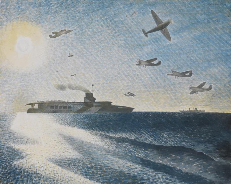 |
| HMS Glorious in the Arctic, 1940, Imperial War Museum |
The artist’s capacity for bringing ordinary things to life in an extraordinary way made him an ideal candidate for the role of war artist and, after serving for a couple of months as an observer of aircraft in Castle Hedingham, he was duly appointed to serve with the Royal Navy. ‘A kind of Christmas present from the Admiralty,’ was how he described the letter confirming this appointment when it arrived in December 1939. Importantly, he and his fellows were encouraged to portray what they saw of the war in their own way, so Ravilious continued to use his trained, hunting eye to ‘mark down beauty’, even when the situation he found himself in was perilous. In June 1940 he was assigned to a destroyer escorting the aircraft carrier HMS Glorious to Norway, where an RAF squadron was to be evacuated. In the luminous watercolour HMS Glorious in the Arctic, Ravilious sought to capture the moment of the mission’s success, but less than a day later the carrier was gone, sunk by the German battleship Scharnhorst. The watercolour became a memorial.
 |
| South Coast Beach, 1941 |
There followed postings to a training submarine, where Ravilious found the material for a dazzling series of lithographs, and to various bases around the coast, where he drew the coastal defences that had transformed ordinary beaches into a nightmarish zone of concrete blocks and barbed wire. In South Coast Beach we have the sense of entering a dream, one in which every loop and twist of wire is perfectly realised and yet of no more substance than a cobweb. In the autumn of 1941 Ravilious flew for the first time, loved the experience, and asked for a transfer to the Air Ministry.
 |
| Ironbridge Interior, 1941 |
From the start he felt at home in the simple, makeshift world of the air force base, writing from RAF Sawbridgeworth in the early summer of 1942, ‘The hardships here are just the sort I like, lovely wooden huts all yellow and green with latrines among the trees, a very hard bed with calico sheets almost like canvas, no pillow, table, chair or looking glass for shaving…’ But he had a hankering to go north again, and so accepted a posting to an RAF squadron in Iceland. It was there, on 2 September 1942, that the aeroplane he was travelling in disappeared, and he was declared missing, presumed dead. He left behind Tirzah and their children John, James and Anne, and a legacy that is only now becoming fully appreciated. As we can see in Ironbridge Interior, one of the last watercolours he painted, Ravilious was a visionary. Not a religious mystic like Samuel Palmer, but a kind of seer nevertheless, a poet of the extraordinary everyday.
Extraordinary Everyday: The Art and Design of Eric Ravilious was held at The Arc, Winchester, Feb-May 2022. There are no plans to tour the exhibition.
5 comments:
Thanks very much for putting this on your blog, James. It was a wonderful exhibition and I was disappointed to not be able to get a catalogue. So it's lovely to have a record here of what we saw.
We saw the exhibition in Winchester, absolutely marvelous. Is it possible to buy a copy a catalogue ?
Can you buy a copy of the catalogue ?
Thanks Jill!
Anonymous, I don't have any copies of the catalogue - you could try the Arc Winchester website or bookfinder.com - thanks
Thank you so much for posting this. I have just seen the film which was brilliant moving and so full of information about this extraordinary artist. I often buy his illustrations on cards at the Ashmolean and now I can put together a better picture of the artist with his wonderful art. Never forgetting Tizrah who probably helped him achieve what he did during his short life by taking on the childcare and chores.
Post a Comment