Showing posts with label David Hockney. Show all posts

Monday, 30 January 2012

Ravilious Watercolours on Show in March!

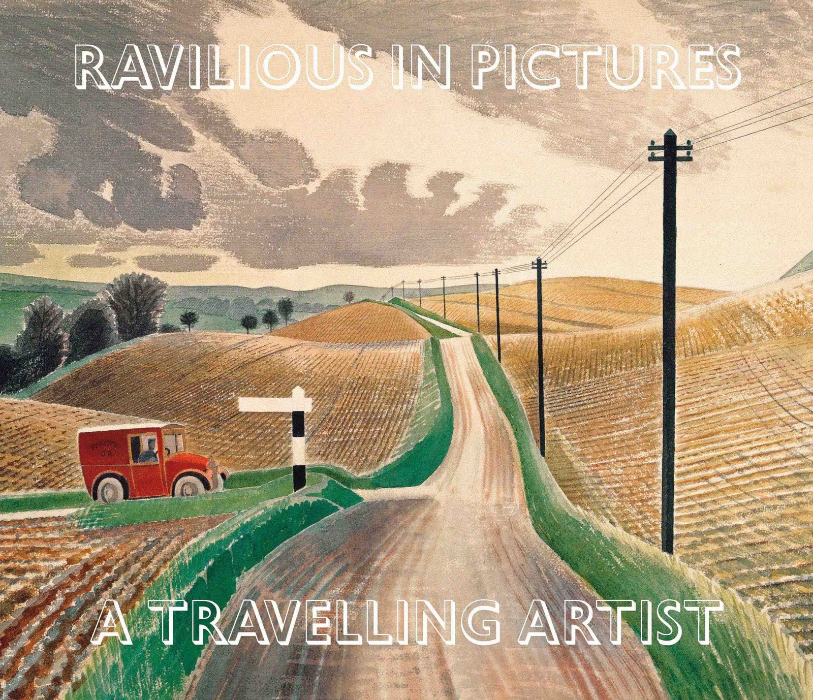
We'll be launching the new book at the RWA, Bristol, on Saturday 10 March!
Exciting news for art lovers in the West Country! On 10 March an exhibition of watercolours, wood engravings and lithographs by Eric Ravilious (1903-42) will open at the Royal West of England Academy here in Bristol.

After the phenomenal success of Ravilious shows in Eastbourne (Towner, 2010) and Saffron Walden (Fry Art Gallery, 2011), it will be wonderful to see a substantial body of work on display in the West of England. I haven't seen a full list of pictures yet, but there will definitely be some favourites on show, alongside paintings that people may not have seen before.

from Ladies Who Travel
At the Towner exhibition, 'Familiar Visions', we saw the artist's paintings of Sussex alongside his son James Ravilious's photographs of Devon. The Fry also took a regional angle, concentrating on 'Ravilious in Essex'. This time around the organisers are taking a slightly more academic approach, using the title 'Going Modern/Being British' as a starting point. It was Paul Nash, the painter's teacher, who asked in the early 1930s whether it was possible to be a modern artist while retaining qualities he considered to be traditionally British. In paintings like 'Event on the Downs' he tackled this question head on, but he'd already addressed it in more subtle ways earlier in his life.

He was particularly influential in the 1920s as a champion of wood engraving and watercolour. These were in no sense new media, but they had been so neglected in the 19th century that they must have seemed fresh and exciting to young artists in the aftermath of the Great War. Nash's 1924 exhibition of landscapes in watercolour was a dazzling success, but with most of the pictures in private hands it is difficult for us to appreciate just how good - and how innovative - this work was.

We are much luckier with Ravilious, who was studying with Nash at the time and went on to master both of his teacher's favourite media. As a wood engraver he was rarely surpassed - a fact that was acknowledged during his lifetime - but as a watercolourist the very good reputation he had built up before his death is only now recovering from a long period of neglect. It's wonderful that so many of his paintings have survived, in excellent condition, and that so many are either in public collections or owned by people who are more than willing to lend them for exhibitions.

Eric Ravilious, Interior at Furlongs, 1939 (DACS)
Ravilious is often described as 'quintessentially English' rather than British, a distinction which I think makes him seem a slightly parochial figure - as does his lack of interest in artistic movements and theories. In fact he numbered Henry Moore and other modernist luminaries among his friends, and travelled as widely as circumstances allowed; he painted ordinary things - an old car, a greenhouse, a barbed wire fence - in a way that made people see them in a new light, which suggests a modern mind at work.

David Hockney, Winter Timber
I'm glad this show will be on at the same time as David Hockney's exhibition at the Royal Academy. The two exhibitions will prove a wonderful study in contrast, with giant, boldly coloured pictures on the one hand, and small, delicately-nuanced paintings on the other - brass band vs solo violin. Yet the two artists also have so much in common, in particular a vital understanding that mystery and beauty reside in the most ordinary scenes.

Eric Ravilious: Going Modern/Being British is at the RWA, Bristol, from 10 March until 29 April
David Hockney: A Bigger Picture is at the RA, London, until 9 April

We will be launching 'Ravilious in Pictures: A Travelling Artist' at the RWA, Bristol, on 10 March, and on 24 March I will be giving an illustrated talk based on my researches for the new book, also at the RWA.

Thursday, 29 December 2011

'Great Expectations' & 'Ravilious in Pictures: A Travelling Artist'

The Greatest 'Great Expectations'? David Lean's 1946 film
Watching 'Great Expectations' the other night I was reminded how important a sense of place can be. Pip and Magwitch are both creatures of the marsh, the lowest of the low. No wonder Pip's sister goes on in typically Dickensian fashion about being 'raised up' - out of the swamp and into society.

It's easy to take the places chosen by artists, writers and film makers for granted. We think of them as settings - a backdrop to the action - yet a place is often integral to the story. Charles Dickens understood perfectly that a place - whether a marshy seashore or a tenement building - can hold tremendous power. Victorian London was a thriving modern city, yet we remember the corners Dickens made into fiction, drawing out the emotion attached to old, picturesque or terrifying streets. Much of his London was composed of relics of the previous century, the city that was rapidly disappearing as the one we know grew up.

David Hockney, Looking at Woldgate Woods, 2006
Some writers and artists focus on places they know intimately. Thomas Hardy reimagined his native Dorset, Stanley Spencer the country around Cookham. Can we envisage the work of either separate from the location? And what about the Brontes? Or John Constable? Having abandoned dowdy Britain for the bright colours of California, David Hockney has returned home, West Coast palette in hand, and found new inspiration in familiar scenes.

Dickens was rather different. He went in search of places and scenes that came with emotional resonance or topicality built in, and in books like 'Hard Times' he borrowed heavily from the dramatic newspaper reports of the day. It's interesting to compare his lifelong quest for captivating places to that of JMW Turner, an artist who travelled widely to find subject matter that captured the violent changes wrought by the steam age.

JMW Turner, Snow Storm - Steam-boat off a Harbour Mouth, 1842, Tate
Curiously, the painters who followed him didn't seem so keen on the subject of place; think of the Pre-Raphaelites with their studied figures. While the work begun by Constable and Turner was taken on by painters across the Channel, it took a new century and the upheaval of the Great War to drive British artists out of their studios on a mass exploration of coast and landscape. After the mechanized brutality of the Western Front there was an understandable desire to 'get back to nature', and at the same time the production of cars and buses by factories that had previously made armaments enabled people to visit ancient sites, historic villages and beauty spots.

Paul Nash, Sudden Storm, 1918 (print from watercolour)
Painters turned their attention to places with an enthusiasm not seen since the early 19th century. Paul Nash set the tone, putting watercolour to use as a medium of modernity and teaching his students at the Royal College of Art to do the same. Among these were Edward Bawden and Eric Ravilious, both of whom took to the medium of John Sell Cotman and Francis Towne with great success - Ravilious never got on with oil paint, which he likened to toothpaste.

In his watercolours, Ravilious focused almost exclusively on place, with figures appearing sometimes as part of the scene, and his career progressed he went further and further in search of inspiration. This quest for new subject matter took him around Britain and into northern France, and it forms the basis of 'Ravilious in Pictures: A Travelling Artist', the fourth volume in the series published by the Mainstone Press. There are some glorious paintings in the book, from pictures of Rye Harbour and Newhaven to watercolours of Capel-y-Ffin and the Welsh hills, and some wonderful stories.

Eric Ravilious, Rye Harbour, 1938 - note Dickensian mudbank
An enthusiastic and accomplished letter writer, Ravilious left brilliant and often hilarious descriptions of the places he visited and people he met, without revealing exactly what he was looking for when he went out to paint, or analysing his work. This fourth book has been particularly fun to research and write, and as it goes into production I'll post the odd excerpt and some more descriptions of my own travels, following this genial ghost around the countryside...

'Ravilious in Pictures: A Travelling Artist' will be published by the Mainstone Press in late Feb 2012.

Tuesday, 1 March 2011

Watercolour at Tate Britain: Highlights


I wasn't sure what to expect from Tate Britain's current exhibition, 'Watercolour'. Reviews were mixed, as was the feedback garnered by the museum from visitors. But though the show has some flaws, it also has quite dazzling highlights.

John Dunstall: 'A Pollard Oak near West Hampnett Place, Chichester', c 1660
In the first room visitors are treated to John Dunstall's tiny but intensely animated drawing of a pollard oak, which is balanced by a giant parish map on which can be seen sometimes unfinished sketches of people and creatures. Critics have complained that the maps and the equally gorgeous illuminated books do not really count as watercolours, but I'm not sure it matters.

The curators of the show have evidently decided to broaden its scope and appeal as far as possible. Yes, you can argue that this policy results in a lack of focus - a lack of art historical narrative - but most visitors to art galleries are not art historians. What we ordinary punters want is something wonderful, or moving, or even disturbing, to remove us for a while from the humdrum of everyday life.

Mark Catesby: 'A blue grosbeak 
(Passerina caerulea) and sweet bay 
(Magnolia virginiana)', c.1728-9
The botanical and natural history paintings in the next room fascinated me. As a terrible draughtsman who can barely write a legible shopping list I was struck by the precision of drawings that were designed to act as scientific record rather than work of art. I was particularly interested to discover a drawing by Mark Catesby, one of whose ancestors had been involved in the Gunpowder Plot. Catesby was raised in Castle Hedingham, Essex, almost 300 years before Eric Ravilious moved there, and it rather appealed to me that their work should appear almost side by side in this extraordinary retrospective of British art.

In fact you'll find the sole Rav on offer - 'The Vale of the White Horse' (1939) in the next room, surrounded by other landscapes including Edward Burra's lovely 'Valley and River, Northumberland' (1972). If I'm tempted to carp about missed opportunities it's perhaps here, because the curators ought to have given us rather more to enjoy. The Ravilious is excellent, but why not include another piece by way of a contrast - the vibrant 'Lifeboat' of 1938, perhaps?

 The Vale of the White Horse (1939), conjured entirely out of cross-hatchings, strokes, dabs and striations of faint colour, frail contour against pale line, with the white page breathing airily in between, is almost nothing, a see-through dream. But it is uniquely strange, starting in reality and ending in its own radiant elsewhere. Laura Cumming, The Observer

Eric Ravilious: 'The Vale of the White Horse' (1939)  
Ravilious would no doubt have been pleased to see his painting in the same room as Francis Towne's 'The Source of the Aveiron' (1781), a watercolour that inspired him, but again we have to wonder why such an influential painter was given so little space. Ditto John Sell Cotman and... well, everyone will have their own list.

Still, if you're going to have one painting by an artist at least make it a good one, and while Cotman's painting of Norwich market isn't quite up there with the work he did in Yorkshire it is a wonderful, strangely modern piece. The same applies to Turner, whose painting 'The Blue Rigi' (1841-2) has to represent him pretty much solo. Perhaps the curators felt we'd all seen quite enough Turners...

Francis Towne: The Source of the Aveiron (1828)
I did enjoy seeing all the watercolour sets and so forth, particularly Paul Nash's sombre kit - fitting for a man who painted in the trenches of Flanders and a good introduction to the room devoted to war art. This mini-exhibition had some peculiar gaps (Ardizzone for one) but - and I think this is more important - did provide some thought-provoking images. The juxtaposition of Paul Nash's darkly exuberant 'Wire' (1918-19) and the frank, intimate watercolours of wounded men was particularly effective.

Samuel Palmer: 'A Hilly Scene', c1828
The remaining sections of the exhibition were marred slightly by the scale of the room, which is much larger than the previous ones. It was hard to focus on a small painting like 'A Hilly Scene' (1828), Samuel Palmer's pastoral treat, and all but impossible to concentrate on the modern work, which seemed (in memory) to involve large expanses of white paper with not much on it.

Again, I don't blame the curators for trying. These days museums and galleries have to get as many people as possible through the turnstiles, and if that means including some famous names then so be it (although you'd think that David Hockney would have lured in a few punters, especially since he curated an exhibition of Turner watercolours at the same museum in 2007...). Better a couple of dubious choices than no show at all.

Patrick Heron: 'January 9:1983:II'
And besides, if you look at what's there, rather than what isn't, you'll be in for a treat. Incidentally, if you're visiting the shop at the entrance to the exhibition, do look out for 'Ravilious in Pictures: Sussex and the Downs', and 'The War Paintings'...

Coming soon: NOT the Tate Britain Watercolour Show...