Showing posts with label Pallant House Gallery. Show all posts

Sunday, 11 January 2026

Caroline Walker: On Solitude

Caroline Walker, Table Laying, Late Morning, May 2020, oil on canvas (artist copyright)
 

On a walk round the autumn sales exhibition at Sothebys last year there were a few works that really jumped out: a smallish Francis Bacon that dominated a room containing a much larger Rodin; an Anselm Kiefer so vast you would need an aircraft hangar to keep it in; and downstairs a painting by Caroline Walker (above) from the series devoted to her mother Janet. Someone bought the painting in the auction and I hope they were as excited as I would be if I were the successful bidder.

I've been looking at and thinking about Walker's work since we met by chance at Hatchards bookshop on Piccadilly before the pandemic. I'd never seen one of her paintings at that point, and when I did get to stand in front of one (at Victoria Miro, I think) my reaction to the work was inevitably influenced by my recollection of her as a disarmingly funny, rather watchful person who warned me that if I googled her name I would have to navigate past an artist who made light-hearted paintings of cows. I doubt this is the case today, with Walker enjoying a growing international reputation. Her exhibition Mothering - now at Pallant House after a successful run at Hepworth Wakefield - has attracted more critical interest than most out-of-London shows.

Caroline Walker, Me & Laurie 6 Weeks Old, 2024, oil on board (artist copyright)
 

I've been enjoying her book of the same name, although as is often the way with art books the experience of looking at the small printed versions of her paintings is nothing like that of standing among them; her paintings are often cinematic in scale, with life-size figures - a reflection perhaps of her interest in film (she would make a great cinematographer). Although Walker does base her paintings on photographs so perhaps it's fitting to see her work in reproduction like this, at several removes and leaps in scale from the real moment that originally inspired her.

What is it that makes Walker's paintings stand out so boldly from the crowd? For a start it's unusual for a contemporary artist to show us real scenes and situations in the way that Walker does. Catching sight of her painting across the room there's an immediate, vivid impression of the scene depicted. We're used to quickly seizing on and identifying images these days, and with Walker the subject is often immediately itself. 

Clearly this is no accident. Walker talks with unusual candour and thoughtfulness about her own work, often drawing attention to her choice of subject matter. In recent years she has focused on the work that women tend to do, from domestic chores to child-raising (paid and unpaid). With Mothering this includes her own experience as a mum twice over, an experience she has analysed (and continues to investigate) with the rigour of a social scientist.

Anyone who has spent time looking at Victorian art will be aware how easy it is for depictions of children to slide into sentimentality, but I think Walker is too tough for that. When asked at a recent event how - in light of this challenge - she goes about painting youngsters she replied with typical disarming humour, 'Well I always try to remember that the head's going to be very big, you know disproportionally big.' A child in a painting is primarily another visual problem to solve.

So there's a sense in which Walker is a hard-nosed documentary maker but her paintings are not simply statements of fact. Her artistic process involves taking numerous photos, setting them aside for a while, then going back to them and either selecting the most interesting one or combining several to create a composition. She then makes drawings (I think to puzzle out the values) and, when she is ready, sets about painting with sureness and vigour. At different stages in this process the moment to be depicted is selected (for design, palette, light, mood), cropped, edited, simplified into lights and darks, and then re-imagined fairly rapidly in paint on canvas. 

Which is a lengthy way of saying that each painting is a carefully considered and yet spontaneous creative act. Walker is a 21st century Scottish Colourist, both controlled and flamboyant.

Caroline Walker, Desayuno, 2017, oil on linen (artist copyright)

When I met Caroline Walker she had been experimenting with different genres and approaches, on the one hand making documentary paintings of women working in nail bars and on the other visiting Palm Springs and LA, where she directed professional models in carefully staged scenes. These paintings have cinematic qualities of tension and anxiety, but on her return to the UK Walker turned away from this approach and back to documentary. 

For the series Home, made with the charity Women for Refugee Women and exhibited at Kettle's Yard, she could not direct the women who posed for her as she had her American models. The photo shoots were sometimes stressful, reflecting the difficult life situations of these vulnerable women, but Walker's tangential, glance-from-the-corner-of-the-eye approach proved a good one and the resulting paintings are both intimate and powerful.   

Caroline Walker, Joy, 11.30am Hackney, 2017, oil on linen (artist copyright)

If this was a tricky assignment then Walker's next major series was in some ways more challenging. Having spent the previous years searching for inspiration among unfamiliar people and places, she turned her attention to the most familiar person and place she knew. The painting series Janet (Ingelby Gallery 2020) is a sort of fly-on-the-wall documentary following Walker's mother on her daily round of chores, a project I imagine both women began in some trepidation given that it would bring public attention to their personal lives. 

But this of course is what makes the paintings so fascinating: Janet's everyday world is intensely private, shared once upon a time by her children, one of whom happened to become an artist with an uncanny ability to conjure magic out of ordinary domestic spaces... Given their shared history Walker must have felt she was viewing her mother through time as well as in space, and I think maybe it's this that lends the paintings their strange, haunting beauty. Janet herself remains (to my eye) rather remote, tantalisingly unknowable even to (perhaps especially to?) her own daughter. 

Just to add another layer of generational complexity, Caroline herself was pregnant while working on this series and now has two children of her own. They appear here and there in Mothering as do other members of her family. Maybe art historians of the future will place Walker's work within the context of the private-is-public social media world, and yes these colour-soaked, eminently instagrammable paintings are certainly of our time.

Caroline Walker, Daphne, 2021, oil on linen (artist copyright)

But I don't think we should focus solely on the contemporaneity of these paintings any more than we should on Walker's choice of motifs. My personal favourite in the current exhibition is Daphne, a typically large-format depiction of the view through a wide downstairs window into the living room where Walker's young daughter can be seen. This was a moment seized by the artist (who rushed out via the open door on the right to take the photo) and then lovingly reimagined. We may notice the framing first - all that blue - and then the bold darks and lights of houseplant and ceiling lamps and then, her head framed between cushions, the little girl. She is inseparable at this moment from the interior with its honeyed light, a child at home where she belongs and perhaps just coming into awareness of this fact; her mother is outside among the blue shadows, looking in.

We all view art through the filter of our own experiences and predelicitions, and subject-wise what I love most about Caroline Walker's paintings is her representation of solitude. Not loneliness (although solitude can be lonely, of course) but the experience of being what we all are: an individual with our own inner life. The people she depicts are often lost in thought, viewed (even when close up) across the space that separates one person from another.

Caroline Walker: Mothering is at Pallant House, Chichester, until 26 April.  


Tuesday, 3 November 2015

Aerial Creatures: David Jones and Peter Lanyon

Peter Lanyon, Soaring Flight, 1960, Arts Council (copyright artist's estate)
I always look forward to the autumn exhibition season, and this year the harvest is particularly, er, fruitful. Nobody needs to be told to go and see the Goya portraits at the National Gallery, but you might not know that the curator is Xavier Bray of Dulwich Picture Gallery, without whom there would have been no Ravilious show. He's my ideal kind of art historian, knowledgable and serious but also down-to-earth and good fun.

I've no doubt people are queuing round Trafalgar Square to see the show, as we British love our portraits as we did in Gainsborough's day, but there are other exhibitions that are well worth seeing. One of the reasons why the Courtauld Gallery is my favourite London venue is that you never know what they will show next. A glance through the gallery's exhibitions archive shows just how eclectic the programme is, with recent outings for Goya, Egon Schiele, Jasper Johns, Durer, Picasso and Peter Lely. It is a rather male list, come to think of it...

Peter Lanyon, Thermal, 1960, Tate (copyright artist's estate)
After Goya's often gravity-defying witches comes post-war aerialist, Peter Lanyon, an artist who meant nothing to me until Dr James Fox explained how his paintings worked. Lanyon seems something of a surprise choice for the Courtauld, but an inspired one, following Towner's William Gear show at a time when post-war British abstraction is not getting much attention.

Not that Lanyon was an abstract artist in the way that Ben Nicholson was in the 1930s, when it was strictly circles and squares only. Lanyon worked that rich margin between the abstract and the real, which in his case meant the landscape, coast and sky of Cornwall; his gliding paintings evoke (I imagine, having never done it) the strange experience of flying alone and unpowered, like a bird with prosthetic wings. For a more in-depth analysis, have a look at Laura Cummings' review.

David Jones, Capel-y-Ffin, 1927, Nat Museum Wales (copyright artist's estate)
Another artist who portrayed the invisible air as a palpable thing, albeit from the ground, was David Jones, the Anglo-Welsh artist whose work is fiercely championed by fans but not easily appreciated by people who haven't put a certain amount of time into the task. Actually this isn't quite true. For a few years in the 1920s David Jones was a bright star, a watercolourist who pleasantly combined sundry influences (Cezanne, Japanese prints, Celtic design) to create beautifully designed, distinctive paintings of places he loved, from Brockley to Capel-y-Ffin.

He was one of an exciting group of painters in a medium undergoing an unlikely 20th century renaissance, and something of a leader. Ravilious and Bawden admired his dry brush technique, and it was Jones who, as Secretary, invited the latter to show with the Seven and Five in 1932.

David Jones, The Terrace, 1929, Tate (copyright artist's estate)
But Jones was not content with his pleasing landscapes. Never a believer in traditional perspective or classical values, he moved further and further from simple representation. In the early 1930s, having written his extraordinary Great War poem 'In Parenthesis', he suffered a severe nervous breakdown, and it is tempting to see the increasing strangeness of his paintings at this time as a symptom of mental disturbance. One could say as easily that Van Gogh's greatest paintings were the product of madness, and I disagree profoundly with this view for reasons I imagine are fairly obvious.

David Jones didn't paint his extraordinary, melting, multi-layered paintings because he was going mad but because he was trying to push himself ever further towards a particular kind of vision. In a way he achieved this layering of realities, from everyday life as he saw it to Arthurian myth, most effectively in his poetry, yet the paintings give a great deal to the patient viewer. You can't simply look at a Jones watercolour and move on. You have to explore it. There are whole worlds contained in his more experimental paintings and sometimes it takes a while just to identify different objects, structures, layers. Everything is transparent.

David Jones, Flora in Calix-Light, 1950, Kettle's Yard (copyright artist's estate)
That this was a deliberate approach is clear when you look at his copper engravings from the 1920s, which show a similarly multi-layered approach. What is so remarkable about his work in watercolour (to which he added smudged graphite for its silvery quality and white body paint for substance) is his ability to dissolve boundaries, abandon traditional ideas of space and yet retain a kind of sense. There's a suggestion of medieval manuscript illumination in the pictures, but mixed in with the flat world of signs and symbols - chalices, thorns, unicorns - is a real, three-dimensional world in which land and sea dissolve into air which is translucent yet solid.

I think David Jones was a remarkable artist, far more adventurous than his mentor Eric Gill. Simon Martin and the Pallant House Gallery succeeded in persuading people that Edward Burra was a great artist despite choosing watercolour rather than oil paint as his medium (current auction estimates for his work are fairly shocking). Jones is harder to get into, but worth the effort.

'Soaring Flight: Peter Lanyon's Gliding Paintings' is at the Courtauld Gallery.
'David Jones: Vision and Memory' is at Pallant House Gallery, Chichester. The accompanying book, by Ariane Banks and Paul Hills, covers engravings and inscriptions as well as watercolour, and is thoroughly recommended.


Tuesday, 17 March 2015

New Exhibitions: Pallant House, Fry, RWA, Ashmolean & Dulwich

Leon Underwood, The Matchbox, 1930 (private collection)
April may be the cruellest month to a poet of melancholy disposition, but for art lovers it brings treats a-plenty, this year more than most. I was selling my wares at the Nadfas Directory Day yesterday and someone mentioned the exhibition of Great British Drawings which is about to open at the Ashmolean. Having visited the print room a few times I am looking forward to this survey of the collection very much. We tend to see only the oil paintings held by museums, but in many cases the drawings, watercolours and other works on paper are as good, if not better.

Visiting a print room is particularly fun, because as you gently lift each carefully conserved drawing out of a box you have no idea what you will find underneath. One Cotman watercolour of the interior of Norwich Cathedral was particularly striking, the bold colour testament to the quality of the care lavished on the painting over the years.

Like a music festival, the exhibition has some big names topping the bill; we are promised Turner, Hockney, Rossetti, Ravilious, Gainsborough and more. I'm sure Ravilious would be amused (and impressed) to find himself sandwiched between Rossetti and Gainsborough.

Whether by chance or by design, drawing is also the theme of a major spring exhibition at RWA Bristol, where fifty-five works on paper from the Ingram Collection are going on show alongside the annual open exhibition, Drawn. The Ingram Collection has a vast holding of Modern British Art, and this selection, dubbed Drawing On, promises work by Edward Burra, John Nash, Barbara Hepworth and sundry other stars of the period.

Weirdly, there's a Ravilious connection with our next exhibition, Leon Underwood at Pallant House Gallery, since Underwood was teaching at the Royal College when Rav was studying there. Apparently, Underwood liked to invite the most promising students for evening get-togethers, and the Boy was one of those so invited, along with Barbara Hepworth and Henry Moore.

Underwood is one of those figures whose influence was probably far greater than we realise. A multi-talented artist and inspiring teacher, he explored wood engraving, sculpture and painting, creating memorable, innovative work in each medium. Travels to Mexico gave him a global perspective that was relatively rare among British artists of the time.

Kenneth Rowntree, Coronation lithograph, 1953
If Underwood exerted an influence on Ravilious, Kenneth Rowntree worked (at first) in a clear-sighted way similar to Rav and Bawden. Twelve years their junior he was fortunate to grow up during a golden age of British landscape painting, but less fortunate to see its glory fade after World War II. I can't help but see the giant, decorative ER he lithographed for the Coronation in 1953 as a tribute to Eric, but perhaps I'm being fanciful.

The centenary exhibition at the Fry Art Gallery is a collaboration with Liss Llewellyn Fine Art, a gallery that has done more than most to promote 20th century British art. If you haven't done so before, you should have a look at their website, which offers an ever-changing array of paintings, drawings and prints by artists familiar and obscure.

Kenneth Rowntree, Toy Boat at Selsey, 1956 (Fry Art Gallery, Artfunded)
Rowntree has his fans but deserves wider recognition for his upbeat but strangely haunting paintings of landscapes, buildings, boats and interiors. I have a copy of the King Penguin book, 'A Prospect of Wales', and his illustrations are a treat.

Meanwhile, in another part of the country... We're hanging the Ravilious show at Dulwich next week and the excitement levels are mounting. The catalogue is back from the printers and looking great - you can pre-order from Philip Wilson Publishers or from good bookshops like Much Ado Books, Hatchards or Toppings...

Monday, 21 July 2014

A Modern British Summer!

Paul & John Nash reunited at RWA Bristol
For a long time the auction houses and dealers have been enjoying a boom in Mod Brit, as 20th century British art is known in the trade. Or rather, as 20th century British painting, sculpture and artist-made design is known.

For those baffled by artspeak, there's a world of difference between 'modern', which now refers to a period from about 1910 to the beginning of the Saatchi era, and 'contemporary', which refers to art being made now - or some of it, at least. For art to be 'contemporary' it generally needs to be non-traditional, as 'modern' art used to be. Nowadays Edward Seago is 'modern', and you don't get much more traditional than him.

JD Fergusson, Bathers: Noon, 1937, (c) The Fergusson Gallery
Of course some Mod Brit artists really were modern. Take JD Fergusson, the Scottish painter who immersed himself in the vibrant visual culture of early 20th century Paris and brought home a wild palette and a boundless zest for life. One of the world's great colourists, he has remained popular since his death in 1963 - but neglected south of the border. Now, however, Pallant House is offering English fans an opportunity to revisit Fergusson's work, as curator Simon Martin explained to me recently.

'Over the past few years,' he told me, 'Pallant House Gallery has carved a niche in presenting reappraisals of overlooked British artists and themes.

'The JD Fergusson exhibition has come to us from the Scottish National Galleries and is very timely as it the first solo museum show of this Scottish Colourist in England for over forty years, and demonstrates the important point that British artists were not working in a vacuum, but working in continental Europe as part of the international avant-garde.'

Great exhibition, great catalogue...
Simon made a name for himself a few years ago with a brilliant exhibition devoted to another overlooked British artist, Edward Burra - a painter of extraordinary originality and verve - and since then Pallant House has become one of several out-of-London museums catering to the renewed interest in all things Modern and British.

Dulwich is only just out of London, but the need for visitors to leave the West End and venture onto the rail network does make Dulwich Picture Gallery a not-quite-London venue. Famous for its gorgeous permanent collection, DPG has also embraced Mod Brit following the startling success in 2010 of 'Paul Nash: The Elements', David Fraser Jenkins' memorable exhibition.


Until 21 September you can enjoy 'Art and Life', a delightful exhibition devoted to the work of Ben and Winifred Nicholson, Christopher Wood and others, in an environment ideally suited to the pictures. These artists, like many of their generation, painted on a relatively modest scale, and the work feels at home in the intimate exhibition gallery at Dulwich. I enjoyed seeing the exhibition at Kettle's Yard, but the paintings come to life in a different way in their current home - worth taking the ten-minute train ride from Victoria to see them again!

Closer to home (for me, at any rate), and close to my heart, is the new RWA exhibition devoted to the careers of Paul and John Nash. I have spent a lot of time over the past few years writing about, thinking about, and generally going on about Paul Nash, and I wish there weren't so many books about him so I could write another one. Oh well.

Paul Nash, Dymchurch, c1922-4, Dudley Museums Service, (c) Tate
A few years ago I had the idea of celebrating the centenary of the Nash brothers' first (and only) joint exhibition, which took place in 1913. I approached the RWA, with whom I had worked on an exhibition of Ravilious watercolours, and they decided to include 'Brothers in Art' as part of their impressive Great War centenary programme. I've been too busy elsewhere to get involved, but curator Gemma Brace has put together a mouth-watering selection of pictures by both artists, including one of the nation's favourite paintings, John's 'Cornfield'.

Like many smaller institutions the RWA is handicapped by the prohibitive charges levied by larger museums and estates for reproduction rights, making it very difficult for them to promote the exhibition nationally, but I hope that word spreads around the grapevine. There are pre-Great War paintings by both artists that have rarely, if ever, been shown publicly before, along with later pictures that are justly celebrated. From Paul a lovely oil of Dymchurch and 'Eclipse of the Sunflower', from John languid views of Bath and the eye-of-God vision of 'Gloucestershire Landscape'.

Almost my favourite picture on public display anywhere in Britain right now is Paul Nash's early watercolour of elm trees in the blue summer dusk, which is featured in the exhibition.

Meanwhile, in another part of the country... we have Towner's wonderful Peggy Angus show, which is full of surprises. When Sara Cooper and I were planning the exhibition we faced a particular challenge in the varied nature of Peggy's career. On the surface, at least, her paintings are very different from her tile designs, and what about her long and distinguished teaching career? How on earth do you represent years in the classroom in a museum show?

As it turned out, her fabulous wallpaper (hand-printed for us by her grand-daughter Emma Gibson) offered a way of pulling the disparate aspects of her career together - as well as causing a lot of jaws to drop. Besides, these different sides of her life were not actually so different. Look for instance at the curving line of the railway in one of her paintings of Asham Cement Works, and then at the undulating design in her Lansbury tile mural, and you can see the same hand behind them. Similarly, the design work she did in the classroom relates closely to her commercial work. Thanks in part to Towner's moveable walls, the exhibition flows nicely, showing us different sides of a single, inspiring, creative mind.

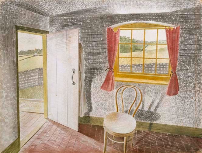
Eric Ravilious, Interior at Furlongs, 1939, Towner

Peggy Angus, The Three Bears, c1945, (c) Estate of Peggy Angus/DACS
We thought a great deal about whether to include Ravilious paintings in the exhibition and decided they were so immediately relevant - given the artists' friendship and shared artistic interests - that it would be crazy not to. Although Ravilious was the superior painter overall, I don't think Peggy's pictures of the cement works, or of Furlongs, suffer by comparison.

Rather, his 'Interior at Furlongs' and her paintings of the same subject complement one another, while the fantastic stage set of the famous table and chairs is a must-see for any true Ravilious devotee. There is even an oil lamp on show that he bought for Peggy from a Lewes junk shop.

In part I think the growing fascination with all things Mod and Brit has a lot to do with our distance from those days, especially the 1930s. You have to be of a fairly decent age now to remember the decade with any clarity, and for those born in wartime or afterwards it has the same air of mystery and nostalgia that the Victorian period had for their parents. For young artists and designers, meanwhile, Peggy Angus must come as something of a revelation - a talented maverick who enjoyed not one but several careers, leaving behind an extraordinary body of work.

FFI:
JD Fergusson at Pallant House
Art and Life at Dulwich Picture Gallery
Brothers in Art: Paul and John Nash at RWA Bristol
Peggy Angus: Designer, Teacher, Painter at Towner


Also playing:

From David Bomberg to Paula Rego: The London Group in Southampton at Southampton City Art Gallery - a century old this year, having been set up on the eve of the Great War to help artists who were shunned by the Establishment, the London Group is still going strong today. It describes itself as 'a thriving democratic co-operative of artists practicing in all disciplines, from painting and sculpture to moving image and performance, with a full annual events programme in London and beyond.'

Keith Vaughan at the Fry Art Gallery, Saffron Walden - an exhibition 'specially devised to reflect the influence of north west Essex on Vaughan by showing 'Essex work'. Vaughan enjoyed relaxing in the Essex countryside where he could explore the constant changes in the natural world and the open sky as a contrast to his life in London. He was also interested in the juxtaposition of geometric shapes provided by vernacular architecture. Many of his later paintings can be traced back to photographs that he took in Essex whilst living at Harrow Hill.'

Kenneth Clark - Looking for Civilisation at Tate Britain

Apologies if I've missed out something obvious - please add a comment!


Monday, 7 October 2013

Ravilious Talk Dates: Pallant House, Richmond, The Fry & Dillington House

Eric Ravilious, Fireworks, 'High Street', 1938
Ravilious fans may be happy to know that I'm giving four illustrated lectures in November and early December. Personally I'm delighted, especially as each talk has a slightly different subject or angle - putting together a slide show for a specific event is great fun.

First, on November 7th, I'm speaking at Pallant House Gallery in Chichester, where an exhibition devoted to Ravilious's work as a printmaker is about to open. I know Simon Martin the curator will have gathered a wonderful selection of prints, books and ephemera, and I'm looking forward to seeing how he's put the work together. I'll mostly be talking about wood engravings - and launching the new Mainstone Press book 'Ravilious: Wood Engravings' - but with excursions into lithography and the artist's designs for Wedgwood. Tickets are on sale here.

Eric Ravilious, BBC Talks Pamphlet, 1934
Taking part in a literary festival is always a highlight, and this year I'm giving a talk on 'Eric Ravilious: A Life in Pictures' at Richmond Literary Festival (that's south-west London, in case there's a rival Richmond somewhere else). Tickets for the talk on Saturday 9 November are available from the festival website, where you can of course see all the other treats in store. This lecture will give an overview of Ravilious's life and work, with plenty of pictures - watercolours, wood engravings, ceramic designs, lithos and photos both archive and modern.

I gave a talk on 'Ravilious in Essex' at the Fry Art Gallery - or at a hall nearby - a couple of years ago, and I'm looking forward to going back on Friday November 15th. This time I'll be discussing printmaking and design in a lecture entitled 'Woodcuts & Wedgwood, Shops & Submarines: Ravilious, Designer', and I'll work in plenty of biographical material, archive photos and so on. Some of the pictures I show will no doubt appear on Christmas cards the following month...


On 1st December, finally, the Ravilious roadshow arrives at Dillington House in deepest Somerset, a wonderful place to visit on a wintry Sunday. I have to confess that I didn't realise, until I was asked to give a talk there, what a fantastic arts programme they have at Dillington. In fact my talk is part of a Big Art Weekend, with lots of other events and courses going on; I'll be showing pictures and talking in informal and (I hope) entertaining fashion about 'Eric Ravilious: Master Artist', with watercolours, wood engravings and design work on show.

If you'd like more information about any of these lectures do get in touch. And if you come along, say hello!


Saturday, 21 September 2013

Ravilious: Printmaker at Pallant House

Robert Gibbings as 'Ganymede', 1931

Following the small but perfectly formed exhibition of Paul Nash prints, books and ephemera from the Clare Neilson Collection, Pallant House Gallery is preparing for an autumn show devoted to Eric Ravilious's work as a printmaker. The museum's De'Longhi Print Room is ideal for this kind of venture, being fairly small and walled with glass display cases, and it will be fascinating to see Rav's wood engravings and lithographs side by side.

On 7th November I'll be giving a talk on Ravilious's work as a wood engraver, in which I will discuss some of the pieces on display in the exhibition. The lecture should be a lot of fun - as with the 'Ravilious in Pictures' books I'll be going behind the scenes of various designs and images to talk about his inspiration, techniques and life.

Submarine Engineer, 'High Street', 1938

ERIC RAVILIOUS: WOOD ENGRAVING

During his short life Eric Ravilious (1903-42) was acknowledged as a brilliant wood engraver, at a time when the medium was enjoying a revival. This lecture explores the evolution of a remarkable talent, from his earliest engravings to the marvellous book illustrations, prints and designs that he created at the height of his career. The lecture promises a visual feast of wood engravings, along with ceramic designs such as the Alphabet and the Boat Race Bowl, images from 'High Street' (his 1938 book of shops) and 'The Submarine Series' (1941), as well as archive photos, sketches and work by other relevant artists. All in all an engaging portrait of a supreme craftsman.

FFI: Pallant House Gallery
       The Mainstone Press


Monday, 22 April 2013

To Chichester by Choo-choo

RB Kitaj, The Rise of Fascism, 1979-80 (Tate/Artist's Estate)
Last Thursday I went to Chichester on the train, a journey that combined beautiful scenery with various human irritations. Did the conductors (there were two on the same train) have to be quite so aggressive in their ticket-checking? Was the woman sitting behind me trying to get into the Guinness Book of Records for the longest monologue about the minutiae of a person's everyday life? 

The train went via Bath and Bradford-on-Avon to Warminster, Salisbury and Southampton, crossing a region that roughly equates both to old Wessex and to Southern Command during World War II. Just beyond Warminster we passed an army depot with rows of heavily armoured, desert-brown vehicles, the austere hills of Salisbury Plain rising behind. We trundled along the Wylye Valley and through Wilton, where two artistically minded generals, Auchinleck and Alexander, held the post of Commander-in-Chief, Southern Command, one after another.


Their Camouflage Officer was Edward Seago, painter, inventor of a new concealment material made from horsehair and subsequently a life-long friend of both men.  I wonder whether he was involved with the crazy scheme to camouflage chalk railway cuttings by spraying them with black ink, an experiment Eric Ravilious was invited to record but which was abandoned too soon for him to do so.

Paul Delvaux, A Siren in Full Moonlight, 1940 (Southampton City Art Gallery)
The spire of Salisbury Cathedral reminded me of two other artists, Rex and Laurence Whistler, the former killed in action in Normandy, the latter responsible for his beautiful memorial in etched glass which you can see in the cathedral. When we reached Southampton I braved a gale to visit the City Art Gallery in the fabulous 1930s Civic Centre, and found some lovely things on display. A Delvaux mermaid stole the scene in the main room, while a moody painting of a forest by Elizabeth Magill showed that the Romantic tradition in British landscape painting is alive and well.

Chichester Cathedral - peregrine falcons nest in top right turret
I also had a look at Paul Nash's painting 'The Archer', which still seems a bit contrived but has a haunting quality shared by the material on display at my final destination, the Pallant House Gallery in Chichester. While Southampton seems to have been constructed by a giant armed with children's building blocks, central Chichester retains its 18th century or even Medieval scale. When Daniel Defoe visited he noted that the city's population could easily fit into the cathedral, and that may well still be true. 

'What will survive of us is love' - The Arundel Tomb
Unusually for a British church, the cathedral doubles as an art gallery, with a painting by Graham Sutherland standing on the altar in one chapel, while elsewhere a stained glass window by Chagall casts a ruby glow on the stone floor and gigantic tapestries dazzle the choir. There are glorious medieval reliefs carved in stone, Philip Larkin's favourite tomb and even a Roman mosaic; few churches can give one such a strong sense of continuous human history - something the vandals of the Reformation didn't think too much about.

Graham Sutherland, Noli me Tangere, 1960
But the cathedral was an added bonus. My real reason for coming to Chichester was to talk about Paul Nash at Pallant House, a gallery that, like Kettle's Yard in Cambridge, champions 20th century British painting and sculpture. The main collection inhabits a characterful 18th century house with small, well-proportioned rooms that might have been designed to show the kind of art on display. A couple are currently filled with Barbara Hepworth's hospital drawings, but otherwise this is a treasure trove of pictures by neglected artists.

Pallant House

Where else would you see a painting by Frances Hodgkins, the New Zealander who was one of Britain's best-known modern artists in the early 1940s? Where, outside Kettle's Yard, might you find pictures by Ben and Winifred Nicholson side by side, so that the similarity between the two is obvious? Christopher Wood is there too, and Alfred Wallis, and Ivon Hitchens, and the Nash brothers. At the end of my talk someone kindly pointed out to me that there was an Eileen Agar self-portrait in an upstairs room.

The main attraction just now is an RB Kitaj retrospective, which you can read all about here. I think I enjoyed most the more straightforward pastel drawings, which show both wonderful draughtsmanship and a disquieting sense of character and atmosphere.


Paul Nash, by Clare Neilson (Pallant)
But I was there because of Paul Nash and his patron and friend Clare Neilson. Her collection of his books, letters and photographs was recently given to Pallant House, and is currently on display. If you're a Nash fan you have to see this. This isn't a curator or critic's interpretation of Nash's career but an intimate portrait of the artist; alongside wood engravings, illustrations and books - 'Places', 'Room and Book' and others - are hand-written letters and photos, stuck to pages from faded albums, showing him playfully posing with standing stones. 

This is the artist I was looking for when I researched 'Paul Nash in Pictures: Landscape and Dream', and it was a treat to see him brought to life in this beautifully presented exhibition.

FFI: Pallant House Gallery

Wednesday, 20 March 2013

Three Dates for April


By a strange quirk of planning I'm doing talks on three consecutive Thursdays next month, each one rather different from the rest.

I'm delighted to be speaking at Bankside Gallery in London on April 11, at the invitation of the Royal Watercolour Society, on the subject of Eric Ravilious: Travelling Artist. This is the theme of the fourth book in the Ravilious in Pictures series (which was supposed to be a trilogy) and it's great fun to talk about. Rav was a talented letter writer with a wonderful sense of humour, so there's plenty of opportunity to go behind the scenes of his pictures and find out what he was up to, and with whom.

This talk has SOLD OUT, so apologies if you've missed out this time.


All change the following week, when (on April 18) I'm travelling to Chichester to give a talk on Paul Nash at the Pallant House Gallery. I'm excited about this one too, partly because Pallant is such a fabulous institutions and partly because my lecture coincides with an exhibition of Paul Nash prints, photographs, collage and books from a collection that once belonged to his great patron and friend Clare Neilson. It sounds as though there's some fabulous stuff in the collection, which was donated by Clare's godson Jeremy Greenwood and Alan Swerdlow, through the Art Fund, and I'm looking forward to seeing it.

My talk will be based on 'Paul Nash in Pictures: Landscape and Dream', but will focus particularly on Nash's long friendship with Clare Neilson.


It's back to Ravilious, then, for the final leg, and for me an opportunity to talk about my new book, 'Ravilious: Submarine', at the National Maritime Museum in Greenwich (free, but you need to book). I wanted to do this partly because NMM staff were so helpful when we were putting the book together, plus I used to live in Greenwich and walk past the Museum every day, so there's a bit of nostalgia involved! I'll be talking about both the making of the Submarine Series and about life aboard a Royal Navy submarine during World War II, so it should be fun.


Wednesday, 19 October 2011

Edward Burra: Pallant House Retrospective

Edward Burra, Country Scene 2, 1970
Why do we neglect British artists so badly? When you think of the effort made by Kenneth Clark to employ painters during World War II, both as war artists and on projects like Recording Britain, you have to wonder what has gone wrong since. Look at Edward Burra, one of the most original and extraordinary painters of the century.

Edward Burra, Silver Dollar Bar, 1948
He worked from the 1920s to the 1970s, travelling widely and painting subjects as diverse as 1930s Harlem, the cafes and hotels of French ports and bizarre skulls and skeletons. Prolific and inventive, he brought to the world an eye that was neither Modernist nor traditional; in fact his vision doesn't fit any of the maps of 20th century painting. For that reason he ought to be celebrated as a true original but instead art historians (the map-makers) have skirted around him.

Burra doesn't even sound British, and his work certainly doesn't look British - where are we supposed to put him? What were his influences and who, in turn, did he influence? Where does he belong in the evolution of art? 

Visiting the recent Watercolour show at Tate Britain I was knocked sideways by a gigantic painting of a church interior. Surely it couldn't be watercolour?! It was too big, too bold. It stuck out among the gentle washes and topographical details like the sorest of thumbs. I didn't know then that the artist who made that picture was crippled, often barely able to use his hands. I didn't know that he painted in the strangest way, starting in one corner and working his way like a spider across the paper. I didn't know that he was born and raised in suburban luxury, just outside Rye, and lived his whole life either at his parents' house (which he hated) or in the town itself (which he didn't like either).

I did happen to know that he was a friend of Paul Nash and studied at the RCA during the 'outbreak of talent' that included Henry Moore, Barbara Hepworth and Rex Whistler (Fine Art) and Ravilious and Bawden (Design). Burra appears in 'Paul Nash in Pictures: Landscape and Dream', accompanying the Nashes and their friend Ruth Clark on a disastrous 1930 trip to the Cote D'Azur...

Edward Burra, Valley and River, Northumberland, 1972
These few bits of information make Ed Burra seem all the more extraordinary, so well done to the Pallant House Gallery in Chichester for putting on the first major retrospective of his work in a quarter-century. Hooray! It starts at the weekend and runs until February, and personally I can't wait to get there. I'm particularly keen to see the late landscapes - there was one fabulous example in the Tate's Watercolour exhibition - with their lovely greens and idiosyncratic design.

A new monograph is being launched at the show, but I would also recommend Jane Stevenson's book and Burra's letters - his writing is as peculiar as his painting. You can also see the artist's work in 'The Strawberry Thief', Jeremy Deller's show at the Fine Art Society - which also features Deller's model of a Ravilious plant house.

For a slightly different take on the subject, look here.